PopCycle
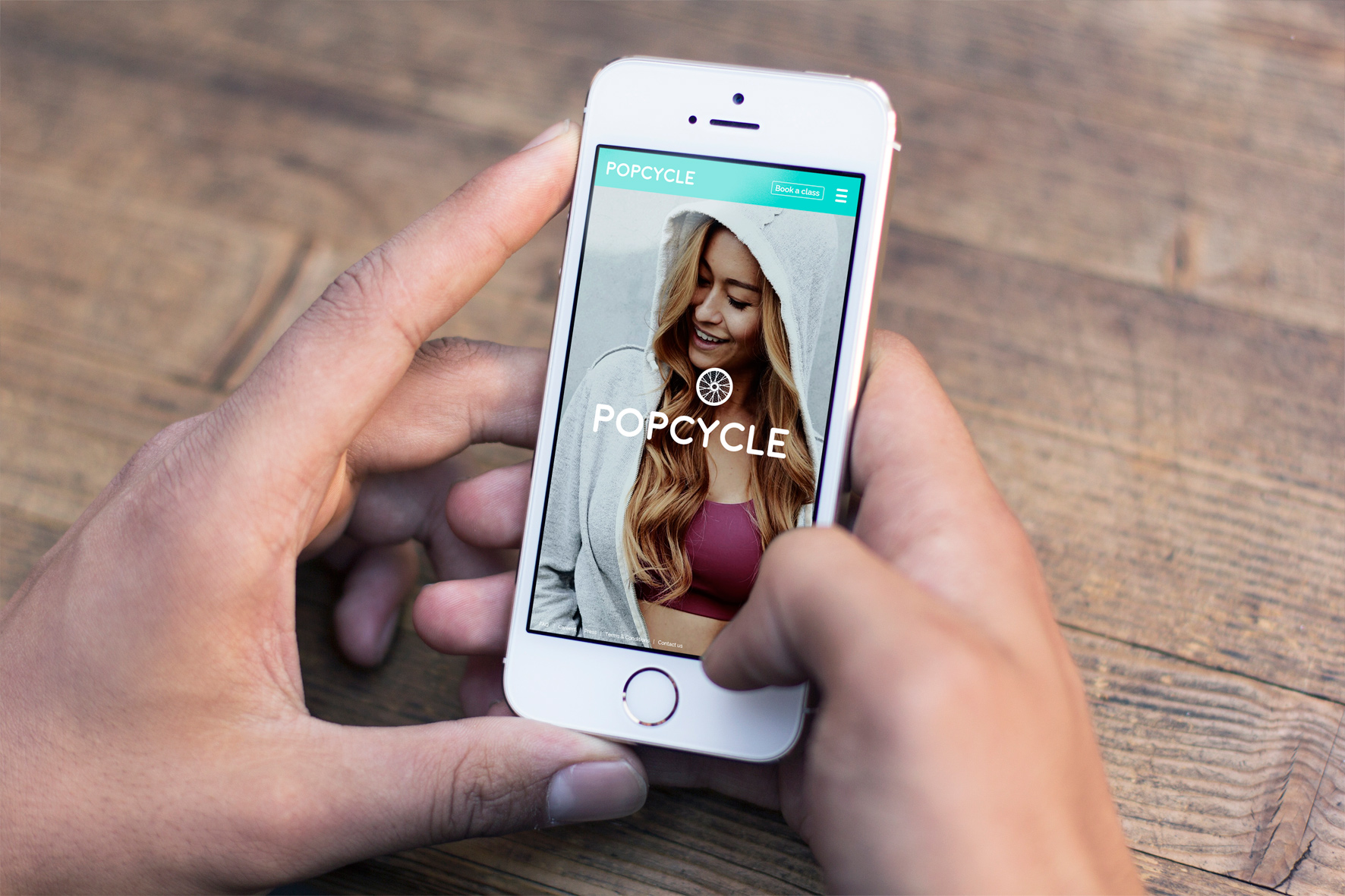
Riding a bike and exercising has never been easier
The Brief
A young South Korean startup set out to create the best platform to book indoor bike riding sessions, competing directly with SoulCycle. The brief: design a product that stood out visually and experientially in a market where the booking flow was the core interaction.
Different Culture, Different Palette
With the core interaction clear, the focus shifted to visual identity. Colour became the primary differentiator — not applying Western aesthetics, but researching how joy, happiness, and energy are expressed in South Korean culture. The result was a bold pop palette with genuine cultural meaning, not decoration.
Interaction & Language
As the platform came together, the focus shifted to interaction quality — sliding titles, smooth transitions, ambient video headers — all designed to make the experience the primary selling point. A parallel challenge: testing how English and Korean language worked together across every screen without visual conflict.
Less is More
A stunning entry point, simple navigation, and an intuitive booking system. From rough concept to reality in a matter of months. This project was personally significant — it demanded designing fluently for a completely different cultural context.
The Challenge — Remote Delivery
Working remotely with a South Korean development team required more than Sketch files and code. A comprehensive element placement guide was delivered alongside the design, ensuring every component was implemented exactly as intended without ambiguity.
Tools & Methods
Sketch, interaction design, bilingual UX (EN/KO), cultural research, remote developer collaboration, design guidelines.