Hotellus
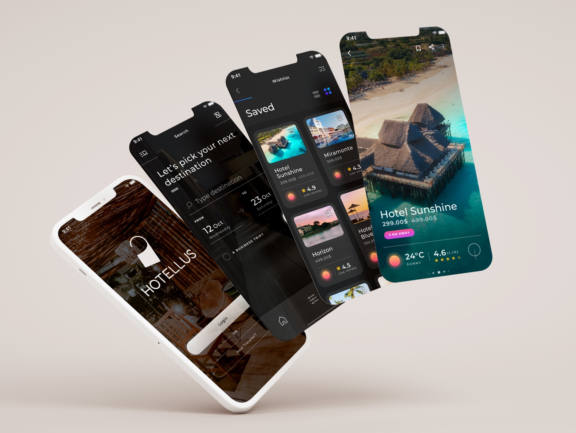
Let us find your next favourite destination
The Brief
Design a mobile app where users can find their next hotel destination quickly — comparing prices, weather conditions, ratings, discounts, and stay durations — all in one place, for any budget, anywhere in the world.
The Problem
Travellers consistently struggle to find the right hotel when search results are unclear or overwhelming, leading to frustration and abandoned bookings. Research revealed a critical window: after just 5–10 minutes of unsuccessful searching, users gave up entirely. The root cause was a search engine unable to translate user intent into relevant results.
The Process — User Research First
User research surfaced two consistent pain points: difficulty finding the right hotel, and uncertainty about whether the displayed price was the true total cost. These insights directly shaped the information architecture and the booking flow.
Design Approach — Minimal UI, Maximum Clarity
A minimalist UI kit was chosen deliberately — photography and space do the visual work, with colour used only where it aids the user in identifying key hotel details. The result: a calm, uncluttered interface that keeps attention on the content.
The Simple Journey
Rather than surfacing everything at once, the flow was designed to guide users step by step toward their ideal hotel. More steps, but each one lighter — eliminating decision fatigue and reducing drop-off. The additional steps increased time-in-app slightly but dramatically reduced frustration, making users significantly more likely to complete a booking.
Lessons
The key question this project answered: is it better to show general results quickly, or specific results with slightly more user engagement? The answer — validated through testing — was the latter. A well-designed guided flow outperforms a fast but overwhelming results page every time.
Tools & Methods
User research, wireframing, usability testing, mobile UX design, UI kit, information architecture.